Climate change and temperature anomalies

Climate change and temperature anomalies
## Rows: 143 Columns: 19
## ── Column specification ────────────────────────────────────────────────────────
## Delimiter: ","
## dbl (19): Year, Jan, Feb, Mar, Apr, May, Jun, Jul, Aug, Sep, Oct, Nov, Dec, ...
##
## ℹ Use `spec()` to retrieve the full column specification for this data.
## ℹ Specify the column types or set `show_col_types = FALSE` to quiet this message.
I select the year and the twelve month variables from the
weatherdataset. And then convert the dataframe from wide to ‘long’
format.
tidyweather <- weather %>%
  # Drop columns that are not needed
  select(Year:Dec) %>%
  # Pivot into longer format with columns 2:13 that contain the monthly data
  pivot_longer(cols = 2:13,
               names_to = "Month",
               values_to = "delta")
Plotting Information
Let us plot the data using a time-series scatter plot, and add a trendline.
tidyweather <- tidyweather %>%
  # use ymd function from lubridate package to create a date variable
  mutate(date = ymd(paste(as.character(Year), Month, "1")),
         # Create month and year variable in the lubridate package
         month = month(date, label=TRUE),
         year = year(date))

# Create plot with smoothing line
ggplot(tidyweather, aes(x=date, y = delta))+
  geom_point()+
  geom_smooth(color="red") +
  theme_bw() +
  labs (
    title = "Monthly Weather Anomalies"
  )
## `geom_smooth()` using method = 'gam' and formula 'y ~ s(x, bs = "cs")'## Warning: Removed 4 rows containing non-finite values (stat_smooth).## Warning: Removed 4 rows containing missing values (geom_point).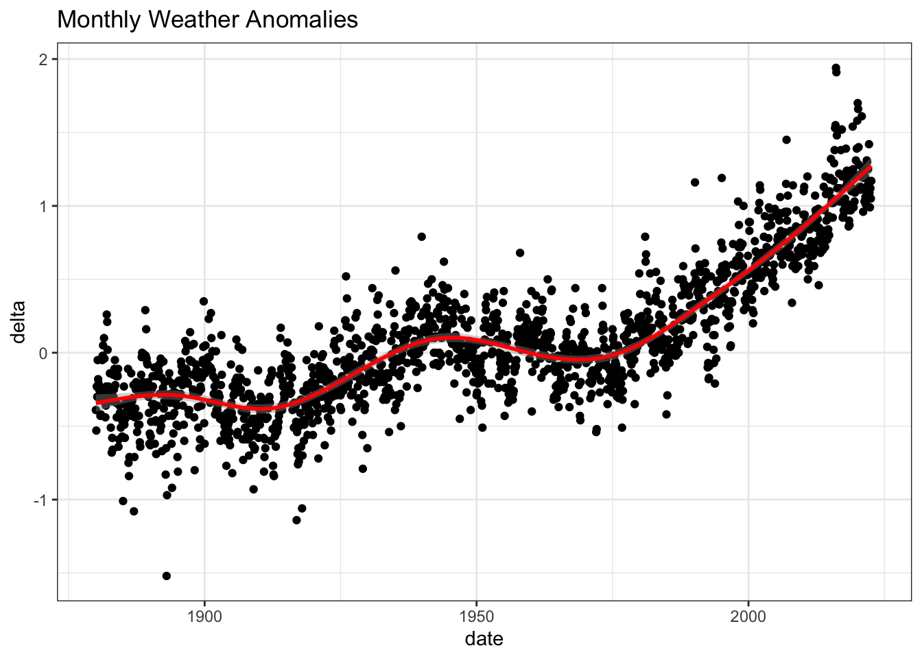
Is the effect of increasing temperature more pronounced in some months?
Use facet_wrap() to produce a separate scatter plot for each month,
again with a smoothing line. Your chart should human-readable labels;
that is, each month should be labeled “Jan”, “Feb”, “Mar” (full or
abbreviated month names are fine), not 1, 2, 3.
# Create plot
ggplot(tidyweather, aes(x = date, y = delta, color = month))+
  geom_point() +
  geom_smooth(color="red") +
  theme_bw() +
  labs (
    title = "Weather Anomalies by month") +
  # One plot per month
  facet_wrap(~month)
## `geom_smooth()` using method = 'loess' and formula 'y ~ x'## Warning: Removed 4 rows containing non-finite values (stat_smooth).## Warning: Removed 4 rows containing missing values (geom_point).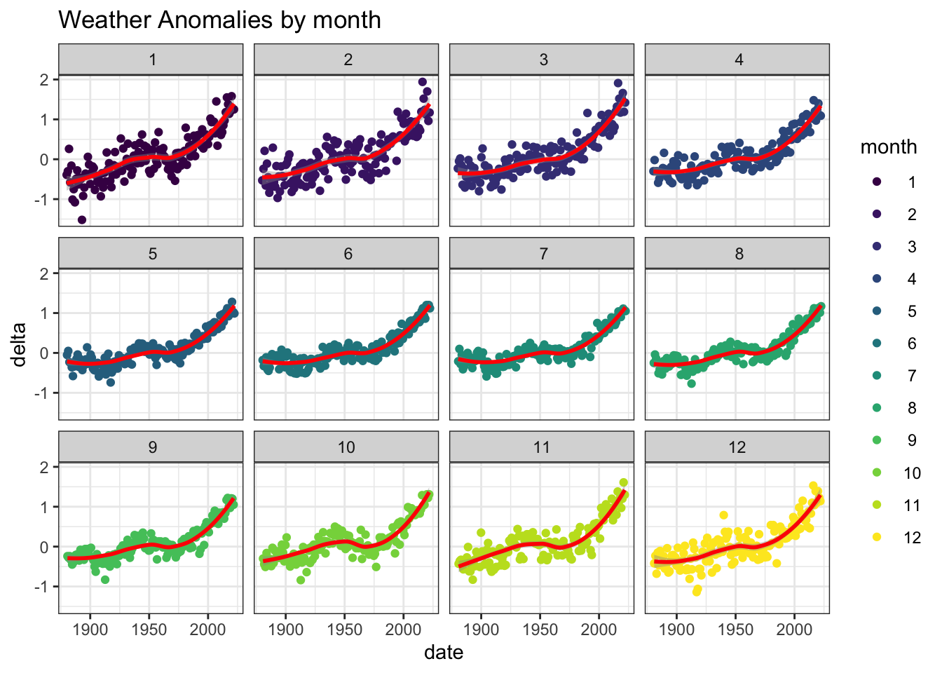
It is sometimes useful to group data into different time periods to
study historical data. For example, we often refer to decades such as
1970s, 1980s, 1990s etc. to refer to a period of time. NASA calculates a
temperature anomaly, as difference form the base period of 1951-1980.
The code below creates a new data frame called comparison that groups
data in five time periods: 1881-1920, 1921-1950, 1951-1980, 1981-2010
and 2011-present.
We remove data before 1800 and before using filter. Then, we use the
mutate function to create a new variable interval which contains
information on which period each observation belongs to. We can assign
the different periods using case_when().
comparison <- tidyweather %>%
  filter(Year>= 1881) %>%     # remove years prior to 1881
  #create new variable 'interval', and assign values based on criteria below:
  mutate(interval = case_when(
    Year %in% c(1881:1920) ~ "1881-1920",
    Year %in% c(1921:1950) ~ "1921-1950",
    Year %in% c(1951:1980) ~ "1951-1980",
    Year %in% c(1981:2010) ~ "1981-2010",
    TRUE ~ "2011-present"
  ))
Inspect the comparison dataframe by clicking on it in the
Environment pane.
Now that we have the interval variable, we can create a density plot
to study the distribution of monthly deviations (delta), grouped by
the different time periods we are interested in. Set fill to
interval to group and colour the data by different time periods.
ggplot(comparison, aes(x = delta, fill = interval)) +
  geom_density() +
  labs (
    title = "Density plot for monthly deviations"
  )
## Warning: Removed 4 rows containing non-finite values (stat_density).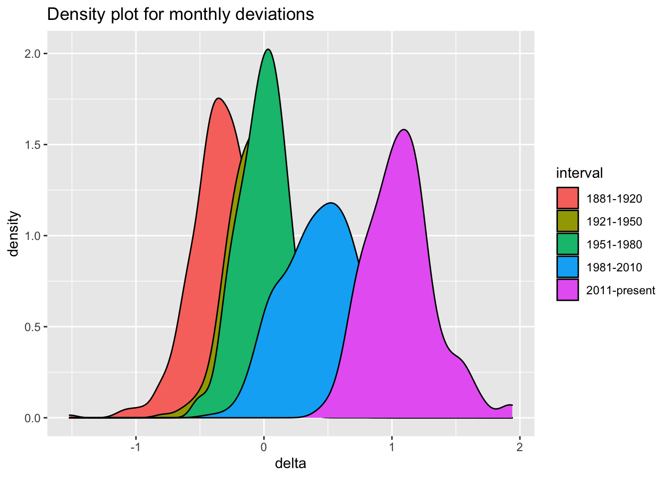
So far, we have been working with monthly anomalies. However, we might
be interested in average annual anomalies. We can do this by using
group_by() and summarise(), followed by a scatter plot to display
the result.
#creating yearly averages
average_annual_anomaly <- tidyweather %>%
  group_by(Year) %>%   #grouping data by Year

  # use `na.rm=TRUE` to eliminate NA (not available) values
  summarise(avg_anomalies = mean(delta, na.rm = TRUE))

#plotting the data:
ggplot(average_annual_anomaly, aes(x = Year, y = avg_anomalies)) +
  geom_point() +
  # Fitting the best line using LOESS method
  geom_smooth(color = "red", method = "loess") +
  # Set theme to have white background with black frame
  theme_bw() +
  labs(title = "Average annual anomalies", y = "Average anomaly")
## `geom_smooth()` using formula 'y ~ x'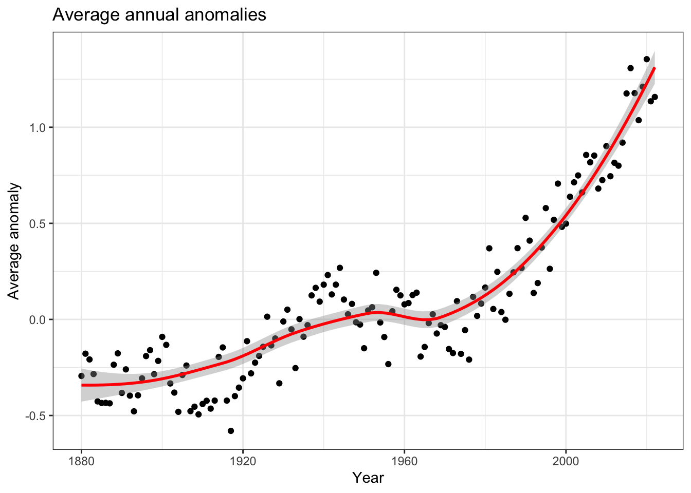
Confidence Interval for delta
NASA points out on their website that
A one-degree global change is significant because it takes a vast amount of heat to warm all the oceans, atmosphere, and land by that much. In the past, a one- to two-degree drop was all it took to plunge the Earth into the Little Ice Age.
Let’s construct a confidence interval for the average delta since 2011,
both using a formula and using a bootstrap simulation with the infer
package.
formula_ci <- comparison %>%
  filter(interval == "2011-present") %>%
  # drop na values to remove 2022 values that are in the future and are not yet available
  drop_na() %>%
  # Calculate avg, standard deviation and count from the data points
  summarise(avg = mean(delta, na.rm = TRUE),
          sd = sd(delta),
          count = n(),
          # Calculate standard error based on standard deviation and count
          se = sd / sqrt(count),
          # Use t distribution because population standard deviation is not known
          # Use 0.975 to have tails for 2.5% of values on both sides --> results in 95% confidence interval
          t_critical = qt(0.975, count-1),
          lower_boundary = avg - se * t_critical,
          upper_boundary = avg + se * t_critical)

#print out formula_CI
formula_ci
## # A tibble: 1 × 7
## avg sd count se t_critical lower_boundary upper_boundary
## <dbl> <dbl> <int> <dbl> <dbl> <dbl> <dbl>
## 1 1.07 0.265 140 0.0224 1.98 1.02 1.11# Calculate confidence interval using bootstrap simulation
# Set seed to ensure reproducibiliity
set.seed(1)
formula_ci_bootstrap <- comparison %>%
filter(interval == "2011-present") %>%
# Specify for which variable we want to construct a C.I.
specify(response = delta) %>%
# Generate 1000 samples from the same data using bootstrap method (sampling with replacement)
generate(reps = 1000, type = "bootstrap") %>%
# Calculate the mean of the 1000 bootstrapped samples
calculate(stat = "mean") %>%
# Calculate the confidence interval based on the 1000 means from the bootstrapped samples
get_confidence_interval(level = 0.95, type = "percentile")## Warning: Removed 4 rows containing missing values.formula_ci_bootstrap## # A tibble: 1 × 2
## lower_ci upper_ci
## <dbl> <dbl>
## 1 1.02 1.11What is the data showing us?
The data is showing us that there has been a significant increase in temperatures. We are 95% confident that the average increase in temperatures is between 1.02 and 1.11. For the t-distribution, we took all monthly deltas and calculated the mean and the standard deviation of this. With that, we were able to calculate the standard error and the t-value and estimate the confidence interval. For the bootstrapping simulation, we generated 1000 bootstrapped samples. The code then generated an approximate sampling distribution and calculated the confidence interval based on that. The results suggest that we have a global change of temperatures of more than 1 degree. If one also consider the average annual anomaly plot (see task before), one can clearly see that we are in a critical situation: The rise is significant and is currently increasing dramatically.